There are over seven popular types of logo design styles and all of them have unique features that could work wonders for your brand. On the other hand, graphic designers are essentially artists and therefore it’s important to develop your own style when creating logos.
So, whether it’s a metallic logo design or typography each designer has his or her own distinct style. Today we’re going to go through what you need to know about all the logo styles you can get and which one you should adopt as your signature design.
Vintage or Retro Logo Styles
Retro and Vintage style logos are great for nostalgic purposes.
Ian Peterman, CEO Tweet
Retro or Vintage logo designs have become extremely popular because of the nostalgia they create. Before you take this approach it’s important to research what era you want to use as inspiration for your vintage logo design. Look at the fonts and color palette used during the era you’ve chosen.

For example, if you’ve chosen the Victorian era, use fonts with thick lines with curls and twirls on the edges. Warm colors such as browns and beiges work well for vintage logo styles.
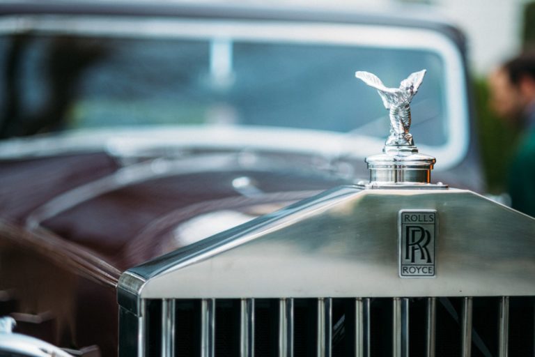
Combination marks, emblems and monograms are the best types of logos to use when developing this style. Vintage logo styles are popular for companies that sell alcohol, vintage cars, cigars and beard grooming kits.
Classic Design Style

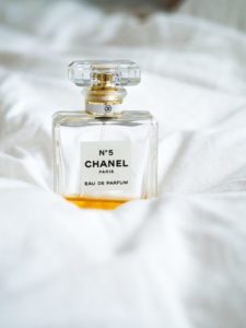
Chanel's branding is an example of classic design style, timeless in its simplicity.
Ian Peterman, CEO Tweet
When you imagine what classic styles look like, think bronze, gold and black. This style is sophisticated and doesn’t utilize quirky fonts or colors. Classic metallic logo designs are streamlined with elegant fonts with metallic accents and dark backgrounds.
The classic styles can be feminine or masculine and just remember not to make it too cluttered or colorful. This style works well with logotypes and monograms. Sometimes people use a minimalistic emblem because it looks graceful in gold or bronze paired with classic fonts.
If you’re designing for perfume companies, fashion labels or coffee and chocolate connoisseurs the classic logo style is an excellent choice.
Eccentric or funny Logo Styles
Depending on your market, you can go a little more fun in your logo design.
Ian Peterman, CEO Tweet
Do you have a young target audience? Perhaps your company sells toys, arts and crafts or you manage a nursery school. Eccentric logo designs are colorful and utilize illustrations to create a positive outlook on the brand.

You can create characters and use whimsical fonts with an eccentric approach. Mascot logos are popular for fun and eccentric branded styles. Line work doesn’t have to be neat so it can be similar to a freehand drawing.
This style is fun to adopt. As long as the images and colors look professional in all sizes and when the logo is printed out, you may have a winner. You’ll also love how easy it is to create.
Minimalistic Modern Logo Styles

Modern minimalistic logos are some of the most iconic logos of the last half century.
Ian Peterman, CEO Tweet
Some brands have had a logo for some time and now they want to refurbish it to look more streamlined and modern. This can be easy if you already have an old logo to work from. On the other hand, if you must create a modern logo from scratch, consider abstract designs.
Additionally, modern logo styles utilize negative space for hidden images within the logo that makes it look unique and appealing. Straight lines are used and there’s minimal detail to it. A maximum of three colors is used throughout the design too.
The modern streamlined logo approach pairs well with brand marks, abstract logo marks and monograms.
Which Logo Style Should You Adopt?
It’s important for you as a designer to know all types of logo styles and how to structure them. But you can adopt one style and use it in all your designs. So which style works best and can be utilized in all the other design styles?
Perhaps the classic approach can be used in all the styles mentioned. You can use classic elements in eccentric designs, vintage, modern and retro. Or you can mix and match them to see what will work together. For example, classic paired with an eccentric style could be a golden bunny on a white background. Classic paired with vintage could use straight-lined fonts instead of curved ones. With modern designs, the classic style could eliminate bright colors and you can use darker abstract accents instead.
Final Thoughts
Designing a logo is an art and even though there are various types of logos, the way in which you design them is what separates them from brands that all look the same. You want your logo to look unique so that it’s easy to identify and doesn’t get confused with your competitor’s branding. That’s why it’s important to develop an innovative style with your logo design styles.
When people see your brand, they must know exactly who you are and what you do. We hope today’s article gave you inspiration on which style will work wonders for your brand.
So which style are you going to use?
Author Profile: My name is Alina McCarran, and I work as a freelance content writer and social media marketer. When not working on my projects, I like to read, draw, and listen to rock music. My favorite band is Queen.
Your Next Steps
Related Conscious Design BLOG Posts
Tools of the Design World: Dropbox
Working with a team can get challenging, especially if you do it virtually. Dropbox makes work easier for you.
Working with files in Dropbox is straightforward. It simply works, no fuss ever. You can create new folders or delete existing ones.
Billifer’s Edibles Co.
Billifer’s Edibles Co Branding and Packaging the challenge Billifer’s needed packaging and branding that stood out in a rapidly growing industry. the solution Packaging that met all requirements while being attractive and creating an eyecatching brand. the results We produced a letter & badge logo and selected colors that stood out without being loud. Packaging provided all the required legal information in a neat and appealing package. the design process creating a design that speaks the language of the customer and the company design assets we provided the graphics and mechanicals for packaging, brand style guide, and digital brand assets ready to start your project? We’re here to guide you through the process of making your idea real and building your legacy. Contact us today to get a quote! Get a Quote want to see more awesome projects? More Projects
Product + Branding
It’s always been the goal to offer complete design services to our clients. Because of this, we have expanded our services to include Product + Branding to help you be as successful as possible! While we started out in Product Development, the time has come to add the next part to the equation. We can more fully help you develop your successful companies, not just products. We’re doing this through Branding. While we’re still building our own website, seems all design firms are behind the times on that one, we’ve been putting together years of projects that our team has completed for branding clients to showcase what we are capable of as a firm. Expanding Team We’ve added a small team of graphic and brand designers to be able to offer this service. Their experience covers many industries, from restaurants to healthcare, cannabis, and manufacturers. Our amazing designers can create a cohesive brand for a company or a product. Because of this, we’re able to create websites, marketing material, and every other area that needs branding in your business or product. This dovetails nicely with our current services and we are excited to work with our clients in the new year in creating amazing brands and products. Complete Design Services If you are looking for complete design services to turn your idea into reality, we would love to help. With our expanded team and our history of success, we can make your vision a reality. We help with both physical and digital products and companies. Follow this blog to see tips and learn about Product Development and Branding. We’d love to help you with your product or brand needs. Contact us to start your project today. We’ll be able to answer your questions and get your project going in the right direction. Your brand matters and we can help you make it valuable. Author Mr. Peterman View all posts


