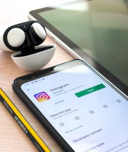
How many apps do you have on your phone right now? Some research suggests that the average smartphone user has 35.
Even though most of us don’t regularly use all the apps we’ve downloaded, just the fact that we potentially have so many should serve to illustrate an important point: apps have a lot of competition.
If you’re designing an app logo, those statistics may be enough to make you sit up straight and take notice. If you still need more convincing about the importance of app logo design, we have four more reasons to take note of.
- Immediate identification
- Harmonious branding
- Accurate messaging
- Effective simplicity
Immediate Identification

Identification is an important factor in designing an app logo.
Identification is an important factor in designing an app logo. Have you ever tried to arrange the app icons on your phone according to color? You might be surprised at how many you have in each basic color group.
And some of the colors are nearly identical — even if they’re based on a gradient. Instagram’s app logo looks a lot like one for Polish, a photo editing app. Google Photos, the Play Store, and Marco Polo all currently draw on the same color palette.
Choosing your color palette carefully when designing your app logo can go a long way in helping the app to stand out from everything else that’s downloaded on a user’s phone. The same is true of the graphic that you use. Stylized letter mark logos are perennially popular in app logo design; however, iconic logos may be even more effective, as they inherently have more scope for unique design.
And it should be mentioned that including entire wordmarks isn’t recommended; generally, there just isn’t enough space to ensure legibility or effectiveness. One, two, or three letters is generally seen as the limit to be included in an app logo.
A logo with carefully chosen elements can do a lot to make your app stand out from the competition, and help users to find your app quickly when they’re looking for it. Studies suggest that humans can process visual images 60,000 times faster than typographic content, meaning that your graphic app logo can have a huge impact in helping your viewers to process and retain your logo.
Harmonious Branding
Are your website and your mobile app interchangeable?
Developing your mobile app isn’t like developing your website, of course, but ideally, they should work well together. Users should feel just as at-home using your app as they do when visiting your site.
A big part of what makes that possible is carrying over your branding and including it in the visuals of the app. Colors, fonts, styles — all of them should connect with what your users already know about your brand. And that ties in to the app logo design, as well. Choose a color and logo design style that complements your existing branding, and this will also enhance how readily your app is identified.
Accurate Messaging
Logos have a bigger bite than their bark.
Logos have a bigger bite than their bark. They’re usually quite small, but the impact they carry is significant. Every piece of branding carries a message, and a logo is no exception. Your app logo is similar to your brand logo in this manner, too — the design of your app logo sends a message.

The colors you choose, graphic you design, the way your limited space is put together — all of it combines to tell the viewer something important about your app and the brand behind it. Compare a restrained, blue-toned letter mark logo like PayPal (sending a message of trustworthiness, which is what you want from a financial app) to a brightly-colored graphic app logo like Marco Polo (sending a message of excitement and fun with plenty of quirk, which is what many of us want from video chatting with friends). Each of them is extremely accurate with their messaging.
You can rely on us to bring the right talent to your project and turn your ideas into a reality. Our team of engineers have the experience and support to ensure your project is complete on time and on budget.
Effective Simplicity
Simplicity is always recommended, from the ground up — whether you’re talking about mobile application development and design, or simply creating the logo that will identify it. Simplicity is effective, especially for smartphone apps. For one thing, simple apps are more user friendly, even for new users — for another, there’s simply less that could go wrong.
Simply put, we are drawn to simplicity.
A simple app logo will appeal to your viewers, communicating the message that the app itself will be user friendly. A stripped-down app logo is heartily recommended by designers, as there is little space available and viewers aren’t likely to spend a lot of time analyzing something with many different elements.
Why App Logo Design Matters To You
Ultimately, without an app logo, your app has no place on a smartphone. You can’t download something without an app to identify it by.
But there’s more to app logo design than simply making it available to users. The way you design the logo can identify your app, send accurate messaging, and draw new users in. In the end, app logo design is just as important as designing a logo for your brand.
Author Profile: Veronica Johnson likes reading, writing and exploring through her travel. With her freelance guest writing, she hopes to achieve both her passion and career in online content marketing. She writes on topics like business, advertising and digital marketing.


